🚀 Web Design • Branding • SEO • Digital Marketing • Mobile Apps • Let's Chat!
🚀 Build • Brand • Rank • Grow

STRATEGY. DESIGN. GROWTH
Digital experiences that elevate brands and drive real results.
We are a full-service digital agency crafting beautiful websites, strong brands and smart marketing that helps your business grow online.
Logos & Branding
SEO & Growth Strategy
Social Media Design
Website Design
E-Commerce Solutions
Ongoing Support
BRANDS WE WORKED WITH


WHAT WE DO?
Result-Driven SEO, PPC, Logo Design & Web Design Services
Blossom Web Studio is a creative digital agency specializing in professional web solutions that help businesses strengthen their online presence and grow their brand. We provide tailored services including logo design, website design, website maintenance, SEO, branding, and social media marketing to support businesses at every stage of their digital journey.
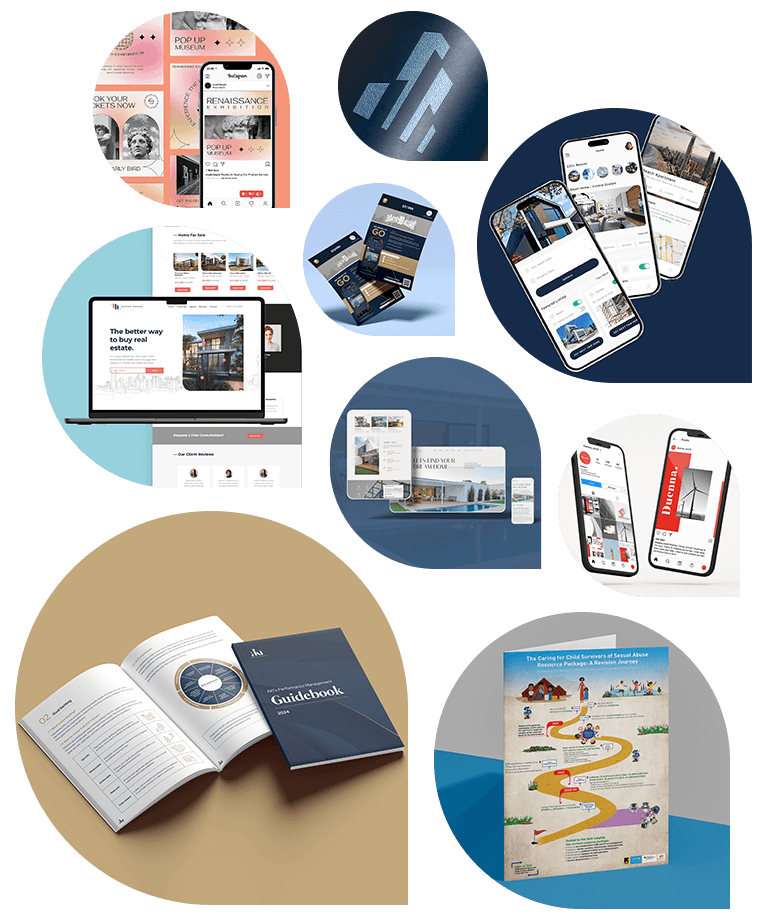
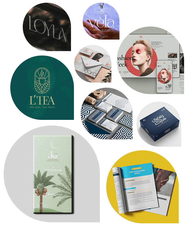
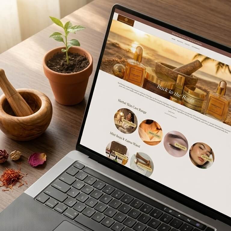
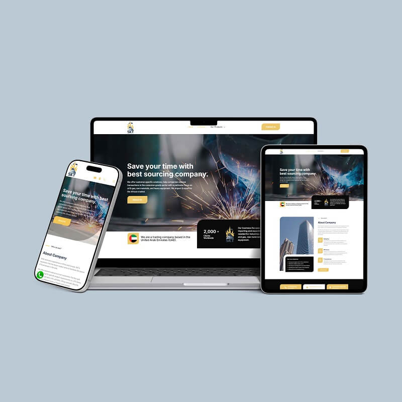
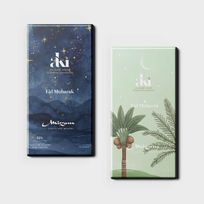
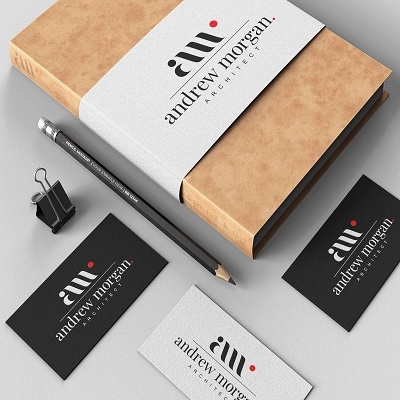
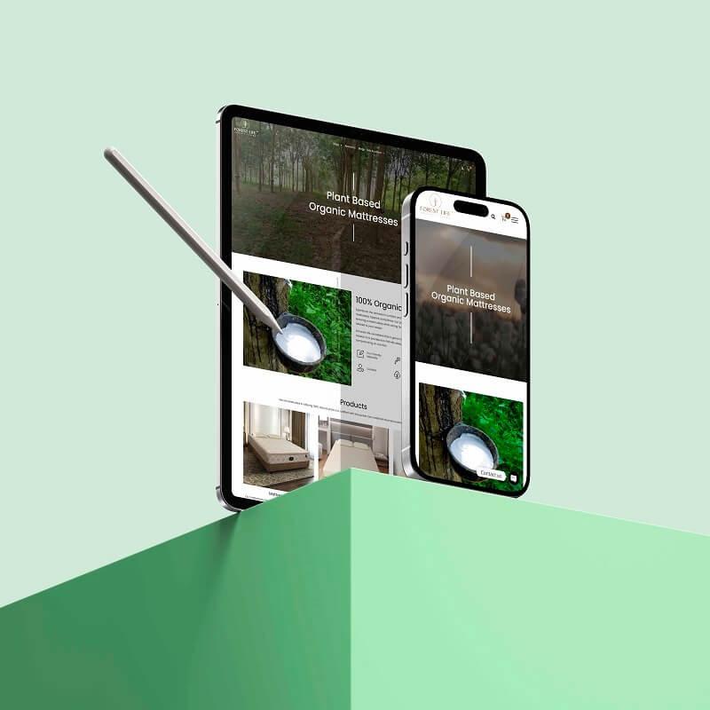
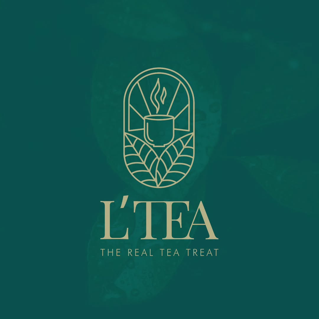
OUR WORK
Beautiful work. Real impact.
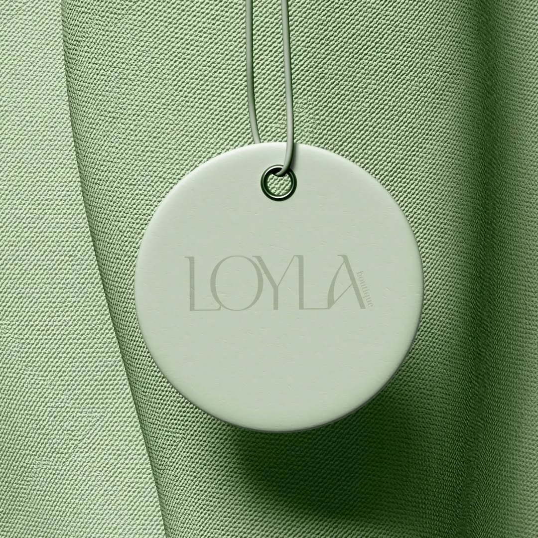
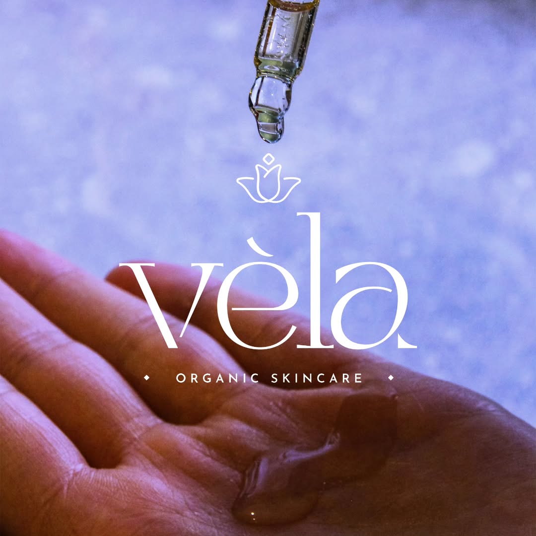
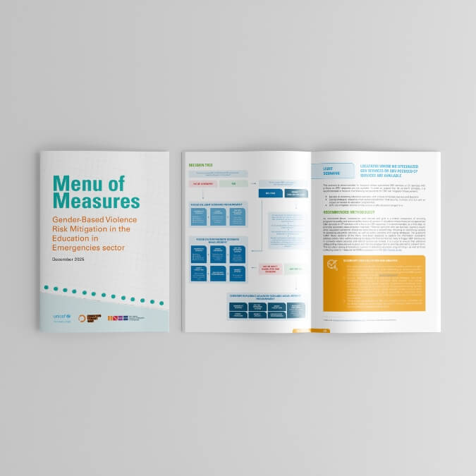
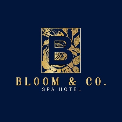
Our portfolio showcases custom logo design, branding, and digital projects that help businesses build memorable identities, strengthen their online presence, and achieve measurable growth.
10+
Years of Experience
900+
Projects Delivered
120+
Happy Clients
20+
Industries Served
OUR PROCESS
A clear process. A seamless experience.
01. Discover
We learn about your business, your goals, and your audience.
02. Strategize
We create a tailored strategy that aligns with your objectives.
03. Design Process
We design, develop, and refine with precision and creativity.
04. Launch & Grow
We launch, optimize, and scale to help your brand grow.
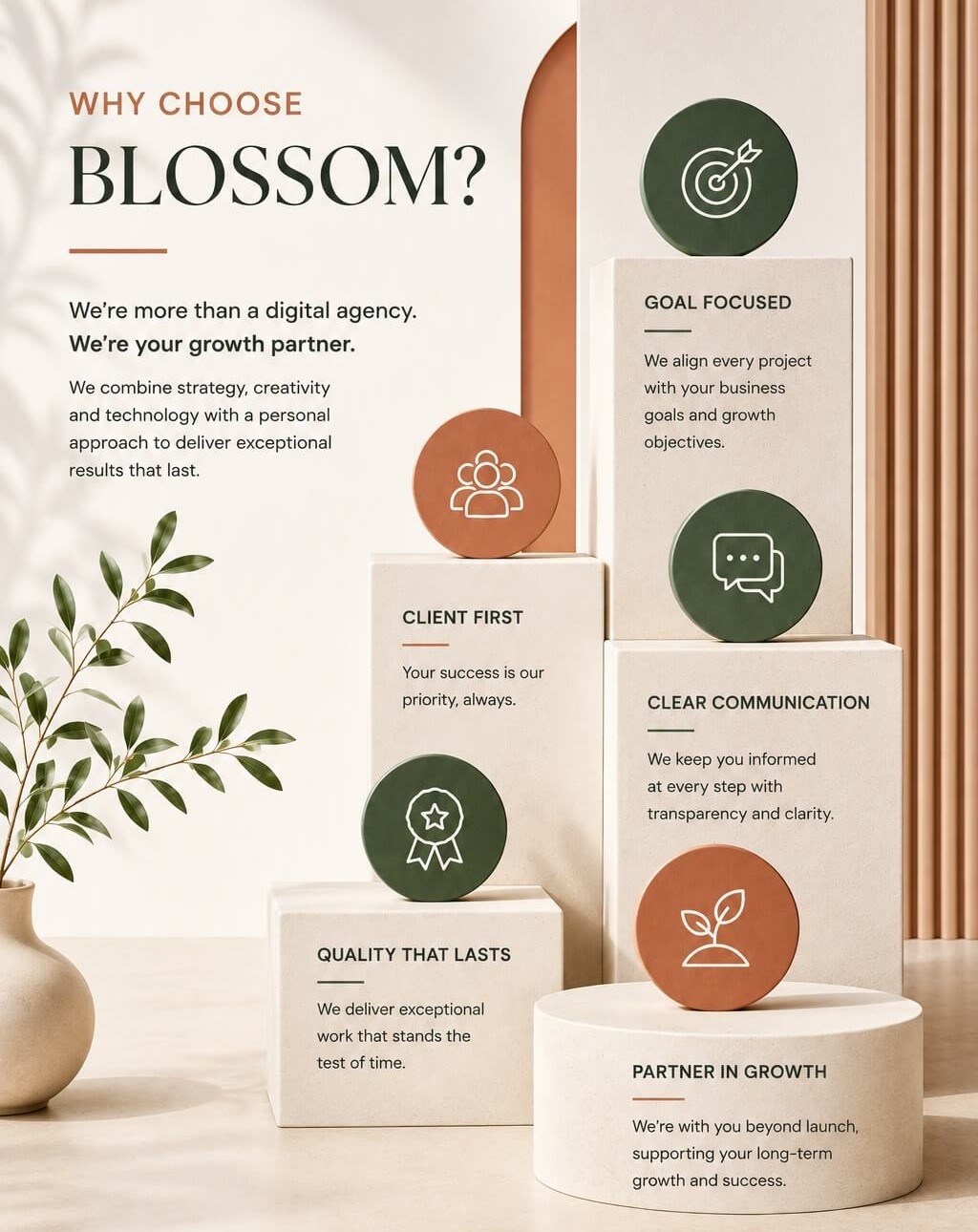
WHY CHOOSE BLOSSOM STUDIO?
Big agency thinking & Boutique agency attention.
We combine strategic thinking with a personal, hands-on approach, giving every project the attention it deserves and every client a team that genuinely cares about their growth.
Strategy before execution
Quality without compromise
Creative thinking, tailored to you
A long-term partner in your growth
Personal, responsive communication
OUR TESTIMONIALS
Client Love.
STAY INFORMED
News & Insights

Headless CMS vs Traditional CMS: Which Should You Choose?
Compare Headless CMS vs Traditional CMS to choose the best content management system for performance, flexibility, and growth. ...more
All
July 08, 2026•7 min read

How to Measure SEO ROI for Your Business?
Learn how to measure SEO ROI for your business using key metrics to improve rankings, traffic, leads, and revenue growth. ...more
All
July 08, 2026•7 min read
Minimalist Logos vs Detailed Logos: Which Works Better?
Compare minimalist logos vs detailed logos to choose the best logo style for stronger branding and business recognition. ...more
All
July 08, 2026•7 min read
Let's build something extraordinary together.
Have a project in mind or just want to say hello?

Have a project in mind or just want to say hello? Let's Chat!


 Let's Chat on WhatsApp